Take your pick: option sets in model driven apps
Life before the unified interface and Power Apps Component Framework (PCF) for model-driven apps for a very plain one indeed. Now something as simple as option sets offers so many more ermmm options than before in terms of user experience and interface.

Custom control
Lets start with whats out of the box on custom control, this one can be used on field with up to 3 options so its ideal for your yes/no/other type option sets, gender is a good one too!
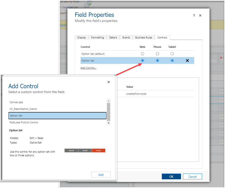
In the classic for designer double click an option set, select the Controls tab and add the control Option Set. Set it to default for web and any otherwise you wish to use. Save & publish then go check out your level one eye candy.
So that was easy but what about the colour? No functionality on the control itself which made me thing it was a code hack to change that. But after seeing it at different customers in different colours I realised it must be a setting *somewhere*….


You cant change the background colour but you can change the colour of the ‘Selected’ option. Head to ‘Themes’, its only in the classic interface for now, find the theme that has Default Theme set to ’Yes’. Clone it.

Change the ‘Legacy Accent Colour’ to any hex code of your dreams. Publish the theme and there you have some level two eye candy.
PS. remember that you cannot change the theme as part of a standard solution/deployment package as its environment specific data (like a team).


Unfortunately the limitation of this control is to have three or less options. If your options are quite long then it doesn’t always look too jazzy and more than three causes an ugly little error. But the shows not over yet… did someone say PCF?
Power Apps Component Framework (PaCF)
As you may know from my previous articles, I love PCF Gallery[1], its an amazing source of creative and talented controls created with the Power Apps Component Framework by the Power Platform community . I’m going to show you a few of my favourites but this is just the tip of the iceberg, there are lots more available already and if your into coding the only limit is your imagination!
Once you have imported the solution, similar rules apply in terms as to how you turn on the control as with the custom controls. The PCF creators are usually very willing t help out if you are struggling at all so don’t be afraid to ask - they are usually delighted to have someone benefiting from their work.
Colour coded option sets

First up we have colour coded option sets [2], super easy to install and set up, it just uses the ‘color’ property on the option value to derive the colour it shows. You need to use the HEX colour code, a really good tool for getting the exact HEX you are look for is here [3] or you can use my other favourite tool Snaggit.
This tool really brings meaning the the options when colour is relevant but also supports the fact that not all users can visually access colour in the same way so the words show too to maintain the meaning and integrity of the data.

Credits to Diana Birkelbach
Icon (or emoji!) option sets
A picture tells a thousand words and icons can really help to ease the pain of data entry for users. This icon option set control [4] is really nicely documented, it uses the Office Fluent UI Icon suite which is pretty extensive. You simply choose the name of the icon from here [5] then set the name in the control properties. The range of icons is really extensive and even includes some emojis/ You can change the colour of the ‘selected’ icon using the HEX code too!

I love the visual yet simple impact the icons have on the user interface, its a really nice touch to a plain old option set that quickly communicated its purpose and meaning.

Credits to David Rivard
Grouped option sets
This one is a little more tricky but the results are worth the investment for those larger unwieldy option sets that need a bit more stricture than a simple a-z or logical sorting. To generate the ‘Grouping Option’ string it need to be laid put as “JSON format key value pairs”. If link me, this meant this nothing to you hen see below for a sample code snippet below. The text in the double quotes (“) is the section name, the number(s) in the square brackets ([]) indicate the value of the option set item you want to add to this section.
{
    "A":[1,2],
    "B":[3,4,5,6],
    "C":[7,8],
    "D":[9,10,11,12],
    "E":[13,14,15]
}
I used an out of the box option set which has very simple values of 1,2, 3 and so on… custom values by default have longer nine digit ‘values’ such as 606,090,000. This value can be changes but beware this can break any code or flow related business which is using this value for automation purposes.

You can group the items in any way that is ‘logical’ for your data set, such a nice way to break down large option sets into manageable and easy to browse chunks.

Credits to Srikanth Paladugula
Who would have thought option sets could be so exciting, now to continue puzzling myself on whats the ‘right’ way to organise the options in the list…! as always any questions or comments please reach out.
[1] PCF Gallery option sets - https://pcf.gallery/categories#optionset
[22] Colour option set control - https://pcf.gallery/colorful-optionset/
[3] HEX code egenrator from images https://html-color-codes.info/colors-from-image/
[4] Icon option set control - https://pcf.gallery/optionset-icons/
[5] Icons available for the for Icon Option Set control - https://developer.microsoft.com/en-us/fluentui#/styles/web/icons#available-icons