Event Registration Cancellation Form Styling in Customer Insights - Journeys
We now have the much awaited ‘Event registration cancellation’ which means organizers and attendees cancel event registrations. You can find out a bit more information in the Microsoft Docs and also a blag post from Malin Martines on how it work/how to set it up. This post will give you a little collection of tips and HTML/CSS tweaks to customise and style the Cancellation Form in Customer Insights - Journeys to make it look a little bit more professional. It’s all easy CopyPasta™ so no coding knowledge is required!
If you want some more tips on how to make forms in Customer Insights Journeys a little bit more beautiful look here.


Find the ‘Event registration cancellation page’ form
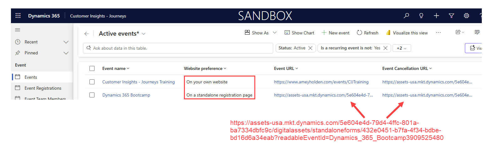
The form for event cancellation should have been automatically created in your system and it’s hiding behind some sneaky form filters. Go to the ‘Forms’ section in the Customer Insights - Journeys app, and update the filter of the ‘Active Marketing Forms’ view as show below to reveal the ‘Event registration cancellation page’ form.
I’m not currently aware of how you have have more than one cancellation form or how to create new ones. Do not delete this form and ideally before you make any updates - take a back up copy of the HTML just to be safe!

How the Cancellation URL Works
This is kind of important to help you test your updates as the only way to see the post submit section and the prefilled data is with the URL to the cancellation form, rather than just the form designer preview. Make sure your event has the field ‘Cancellation URL’ filled in, it should be generated automatically when you publish the journey but might be blank for old journeys or if you are using a customised event form that interrupts with OOB scripts - the link will be the same as a standalone registration page URL which is really confusing. When you add the ‘Cancel’ button into an email, the URL is dynamically generated to append the parameter eventRegistrationId=ER 123456789ABC67382 (taken from the event registration row in dynamics. Which then uses the cancellation form.
e.g. Event standalone page -> https://assets-oce.mkt.dynamics.com/orgGUID/digitalassets/standaloneforms/FormGUID?readableEventId=ReadableEventID&eventRegistrationId=ER 123456789ABC67382
If you are embedding form on your website, the cancellation URL is defaulted to a standalone registration page URL and follows the same process as the URL above, but you can also customise this to use your website event registration page and passing in the eventRegistrationId as a parameter instead e.g. https://www.ameyholden.com/eventpagename?eventRegistrationId=ER 123456789ABC67382

Important Note: Be really careful about deleting elements from this form and customising it too heavily as it will likely break the script/wizardry in play.
Page Title
Now the warnings are done - lets begin! A small little detail, but so simple to do and makes things look a bit more official here.


Image
The lovely library of clip art is back with another delightful icon. Replace this with your company logo or a different more on brand calendar icon of your choice.
Update the properties of the CSS declaration .registrationCancellation .calendarIcon {} as shown below.
width: auto;
height: 120px;
background-image: url('https://assets-usa.mkt.dynamics.com/5e604e4d-79d4-4ffc-801a-ba7334dbfc9c/digitalassets/images/710350a7-0286-f011-b4cb-7c1e5214676a?ts=638921974441237043');

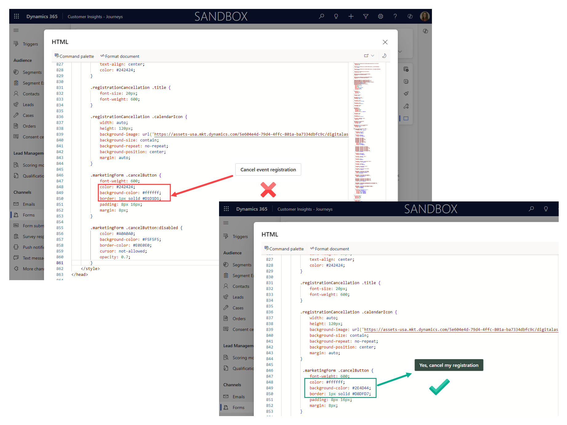
Cancel Button
The button is a nice neutral colour but it also looks a bit too discrete to be a call to action. Update the styling to match your brand colours.
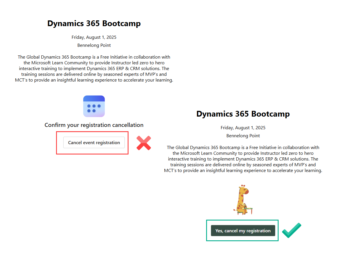
Update the text of the button, noting that the text is different for cancelling session registrations than it is for cancelling event registrations.

Update the properties of the CSS declaration .marketingForm .cancelButton { as shown below. ‘color’ is the text colour and ‘background-color’ is the button colour.
color: #ffffff;
background-color: #2E4D44;
border: 1px solid #D8DFD7;
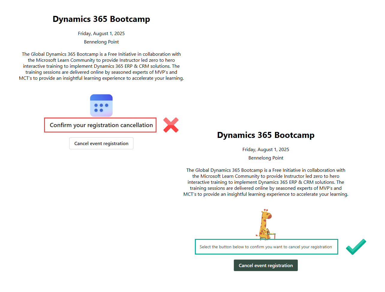
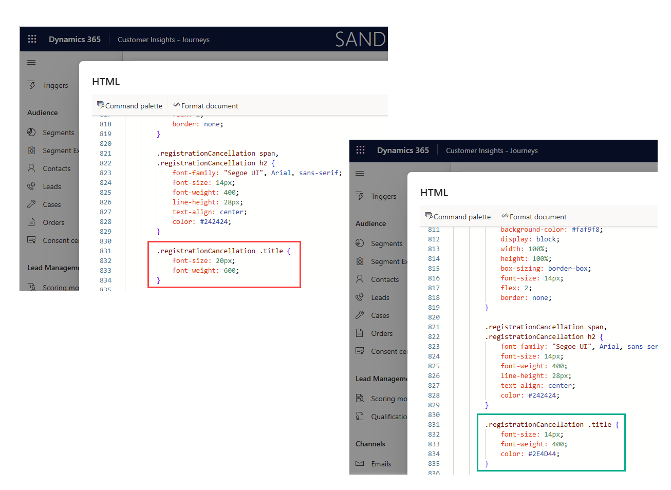
Call to action text and styling
This text section just looks really jarring to me. Style according to your brand and layout preferences (or just remove it entirely!).
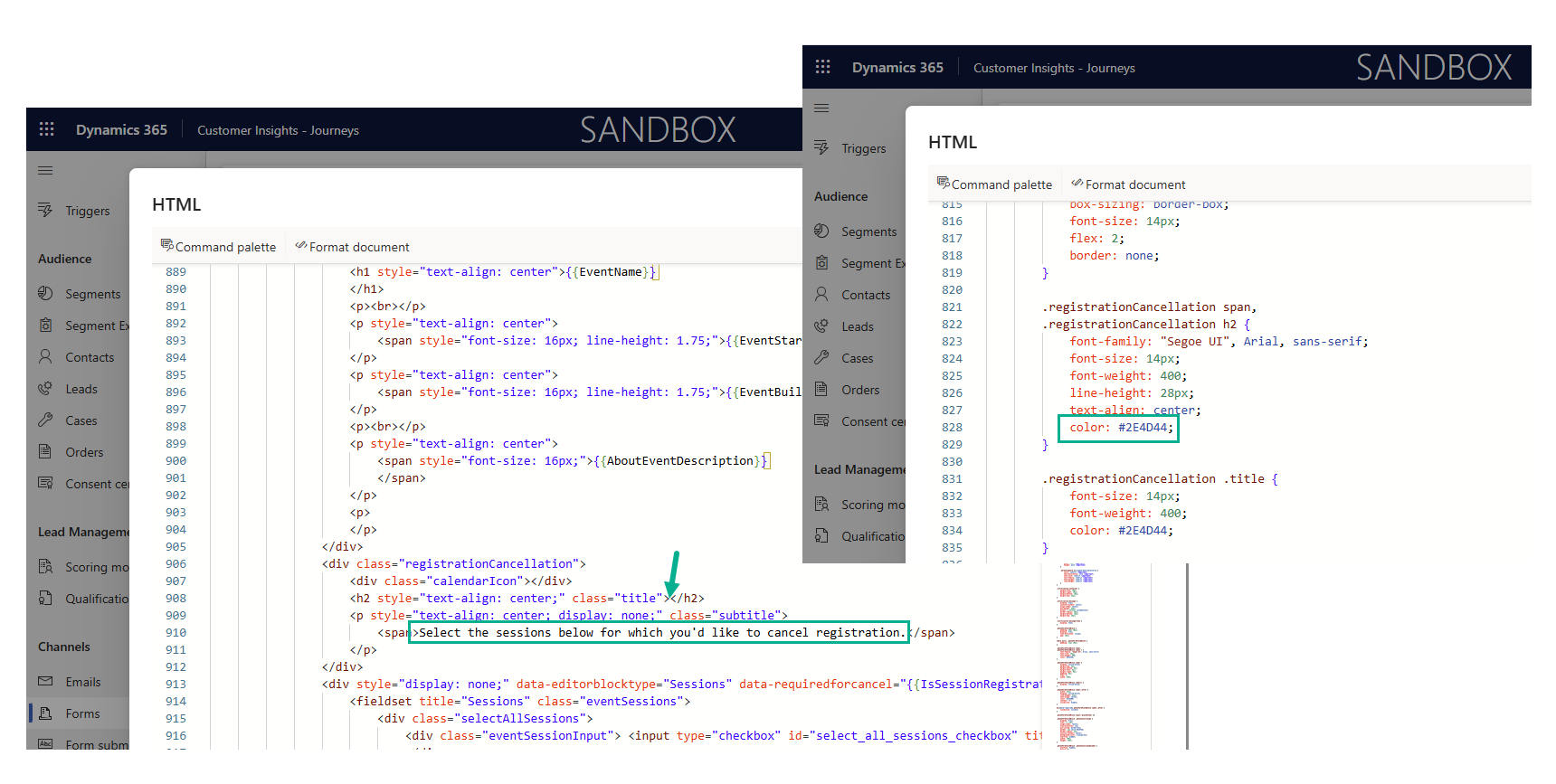
Update the properties of the CSS declaration .registrationCancellation .title { as shown below.
font-size: 14px;
font-weight: 400;
color: #2E4D44;
Update the text of the message, noting that the text is different for cancelling session registrations than it is for cancelling event registrations.
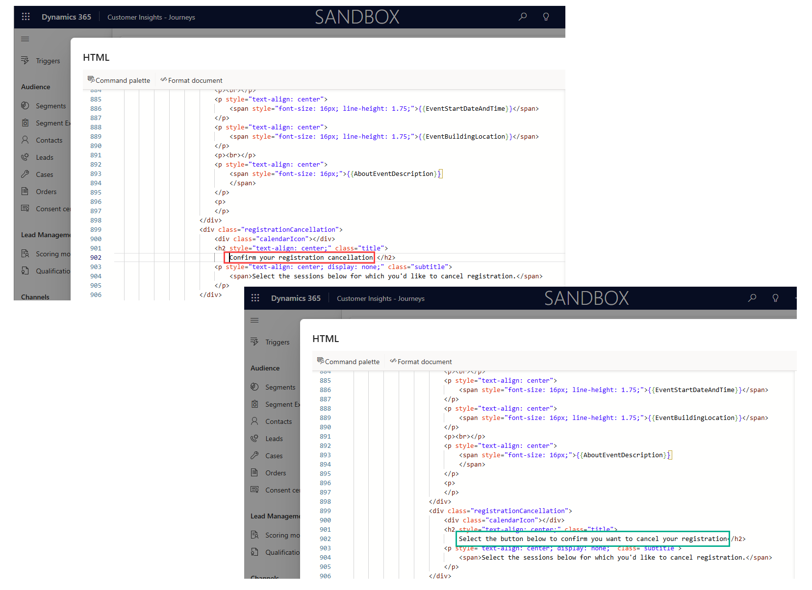
If you are using sessions, then you may want to make things a little different here by removing the duplicated call to action that shows and styling to session text as well.
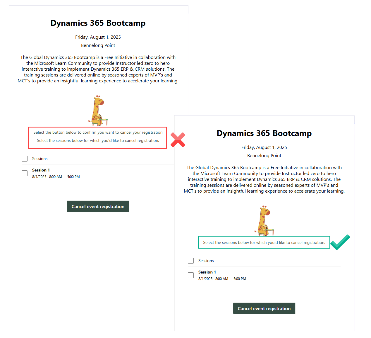
Remove the ‘Confirm your registration cancellation’ text and update the .registrationCancellation span, .registrationCancellation h2 { declaration as show below
color: #2E4D44;
Style event details
You can use the normal text editor functionality to style and adjust the event details section to change things like font colour and size. Personally I would also update what information shows because at the point the person is cancelling a registration do they really need the location/description information?

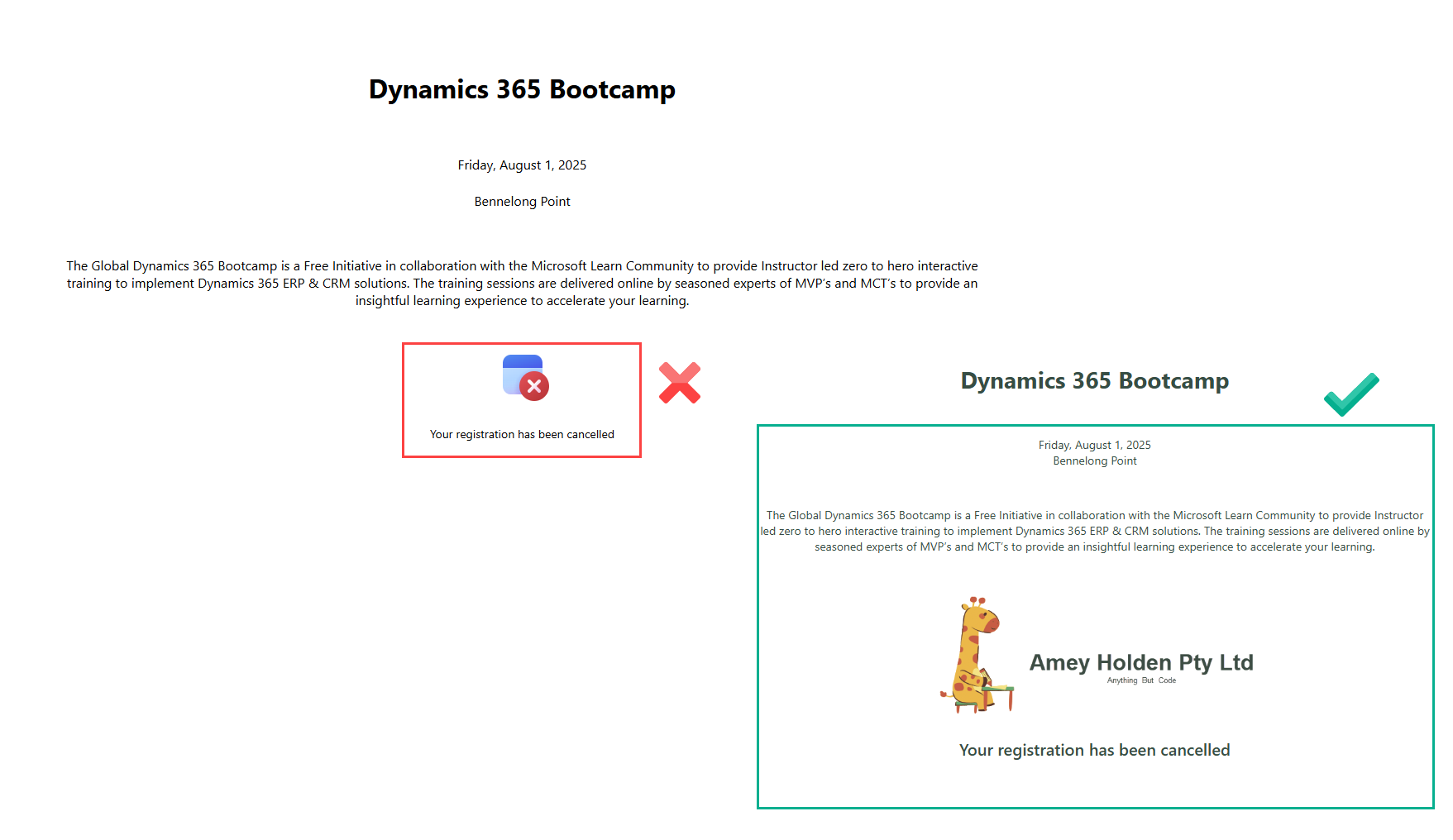
Post Submission Image & Text
After the form is submitted its another jarring clip art choice where the red cross could easily be confused for an error or issue rather than a successful cancelation. Update this to your company logo or an alternative more intuitive icon of choice.
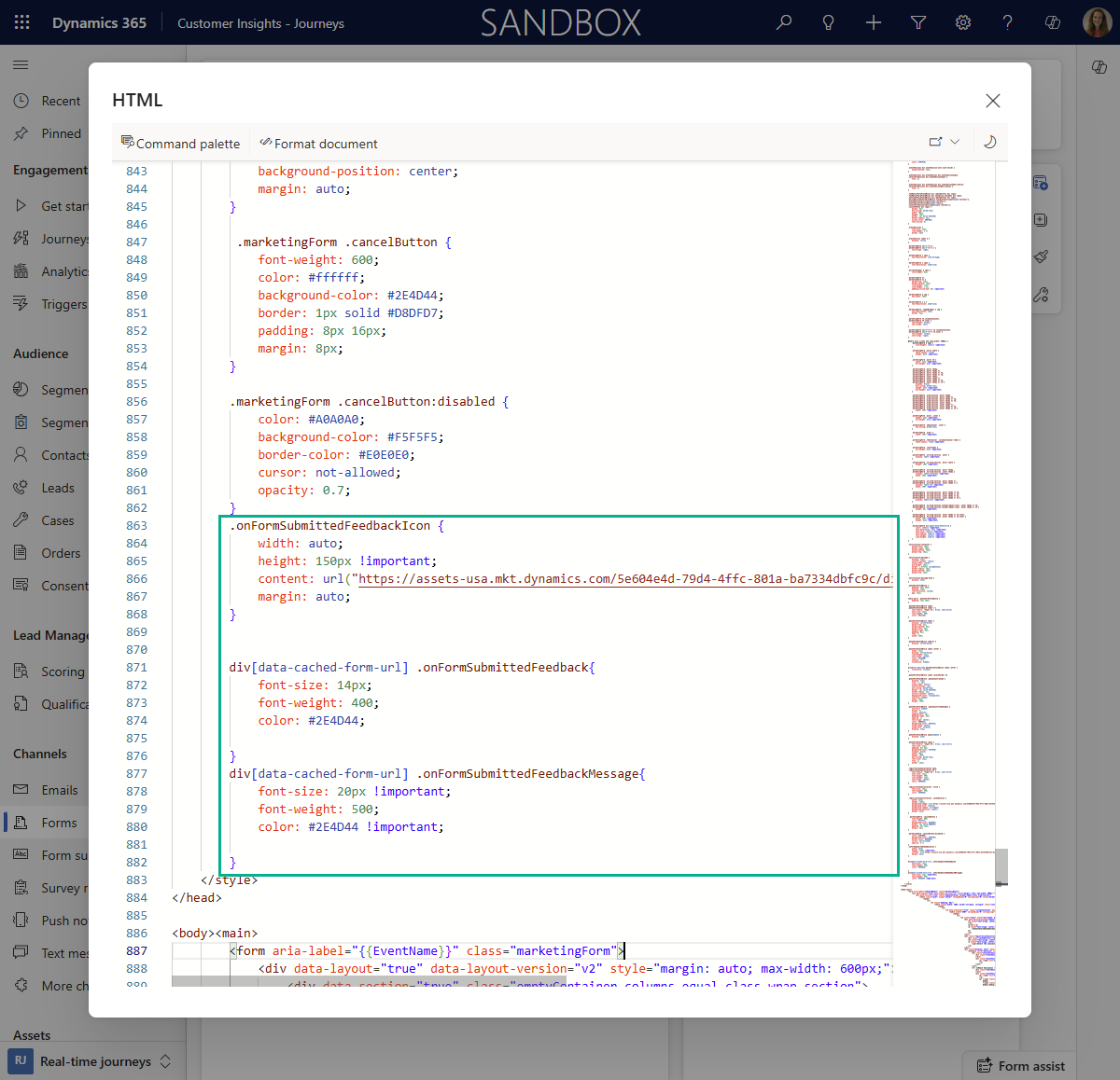
Insert the CSS below into your form just above the closing </style> tag to update the onFormSubmittedXXX declarations.
        .onFormSubmittedFeedbackIcon {
            width: auto;
            height: 150px !important;
            content: url("https://assets-usa.mkt.dynamics.com/5e604e4d-79d4-4ffc-801a-ba7334dbfc9c/digitalassets/images/5f82081e-b1de-ef11-a730-7c1e527e6962?ts=638738005813570235");
            margin: auto;
        }


        div[data-cached-form-url] .onFormSubmittedFeedback{
            font-size: 14px;
            font-weight: 400;
            color: #2E4D44;

        }
        div[data-cached-form-url] .onFormSubmittedFeedbackMessage{
            font-size: 20px !important;
            font-weight: 500;
            color: #2E4D44 !important;

        }
That’s better!
And that concludes a rogue dive into CSS and HTML editing in the name of more visually appealing cancellation forms. Thank you if you care enough to do these things, it makes me happy!

